What is Tylil? #
Tylil is an online store I am working on for K-pop, K-drama, and other pop culture merchandise. The catalog includes clothing, jewelry, plushies, keychains, photocards, physical releases, and a lot of other collectables that do not fit cleanly into one category.
This is a little different from the other projects I have written about. A game menu only needs to know about the buttons I put inside of it. An online store is always changing. Every time I add a product, the catalog, filters, and navigation have to keep up with it. A layout that works for twenty products might be awful for five hundred.
Tylil is hosted on Shopify, but the storefront itself is made with HTML, CSS, JavaScript, and Shopify Liquid. Liquid is the template language that takes information from Shopify, such as a product’s title, image, price, availability, and tags, and turns it into the HTML a customer sees. Shopify handles the commerce side while I control how the store looks and how people move through it.
Visual Design #
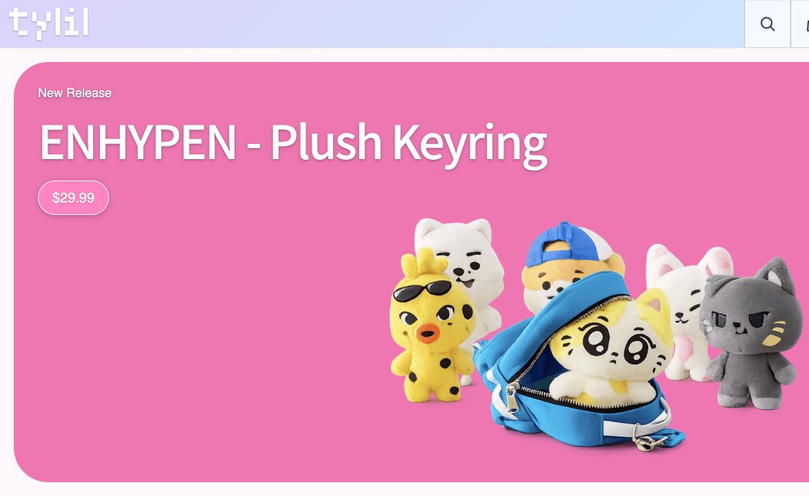
I went with a pixel-style logo and headings because I wanted the site to have a little personality. I kept the rest of the text simple so the store would still be easy to read. The header uses a light blue and pink gradient, most of the page is white, and brighter pink is used for selected filters and important buttons.
The large homepage features are basically oversized cards. Each one has a product image, a short label, a title, and a price. The entire thing is clickable. I like these more than a regular banner because they still look interesting while actually leading somewhere useful.
The harder part was carrying that same design into the normal product grid. A featured product has plenty of room. A product card has to fit an image, a long title, a price, and sometimes a button into a much smaller space, and it has to repeat dozens of times without the page turning into visual noise.
The Product Card System #
Every product card is built from the same Liquid component. The card itself is an article with three main parts: a link, a square media area, and the product information. The title and price sit underneath the image. The link is stretched over the whole card instead of being limited to the title, so clicking almost anywhere opens the product page.
The media area always uses a 1:1 aspect ratio. Product photos come in all kinds of dimensions, but the square frame keeps every row lined up. The image is cropped inside that frame rather than letting one tall photo stretch the entire grid. On a desktop, the product page uses four cards across. On a phone, it drops to one card per row so the image and title still have enough room.
I also use responsive image sources. Shopify can generate a smaller 360-pixel image and a larger 720-pixel image from the same product photo. The browser chooses the version that makes sense for the card and screen size. Products near the top of the page load immediately, while images farther down use lazy loading. There is no reason to make somebody download an image for the thirtieth card before they have even scrolled past the first four.
Some cards include a quick Add to cart button. I only show this when a product can be added without asking the customer to make another decision. If the product has options that need to be selected, the card sends the customer to the product page instead. It would be faster to put the button on everything, but it would also be confusing if the store silently chose a color or character for the customer.
The code for the card is pretty simple, which is kind of the point. I give it a product and it prints the same structure every time. If I change the border, image behavior, or price formatting, I only need to do it once instead of fixing every collection page separately.
Sorting the Catalog #
The sorting menu has four choices: newest to oldest, oldest to newest, price low to high, and price high to low. I did not want JavaScript loading the entire catalog and trying to rearrange everything in the browser. Shopify already knows how to sort the products, so I let it do that work.
When a customer changes the menu, the selected order is added to the URL as a sort_by value. For example, choosing price low to high changes the collection URL to ?sort_by=price-ascending. Shopify receives that value, orders the products, and sends back the new page. The browser is not trying to move hundreds of existing cards around by itself.
Because the sorting value stays in the URL, refreshing the page does not erase it. The back button works, the page can be bookmarked, and pagination carries the same order onto the next page.
The Filter Sidebar #
Sorting changes the order, but tags decide which products appear. This became much more important as I added products. At the time of writing this, the catalog has over a thousand tags. That includes broad tags such as Clothing and K-pop, but also groups, characters, materials, product types, and drama titles.
Opening Filter shows a searchable sidebar. Typing into the search box filters the tag list immediately without reloading the page. Searching for CORTIS, for example, narrows more than a thousand choices down to three matching tags. Clicking one adds the tag to the collection route and reloads only the matching products. The active-filter counter changes to show that a filter is being used, and the clear option returns the customer to the full collection.
The tag and sorting value can be used at the same time. A CORTIS page sorted from the lowest price to the highest looks like /collections/all/cortis?sort_by=price-ascending. Shopify reads both parts and returns the right products in the right order.
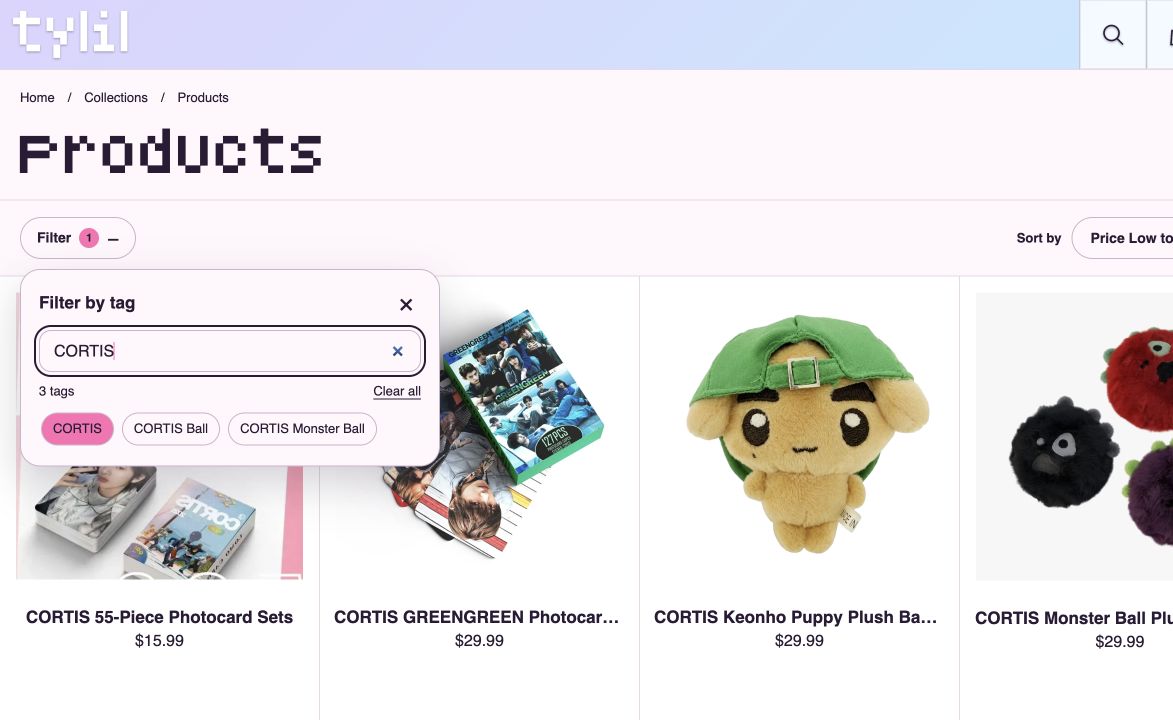
To be completely honest, there are way too many tags right now. The search box stops the list from being impossible to use, but I still need to clean it up. Collectable and Collectible, for example, should not be two different tags. There are a bunch of small duplicates like that from products being added at different times.
The Main Sidebar #
The other sidebar is the main navigation menu. I kept the normal header very small: the Tylil logo on the left and search, cart, and menu controls on the right. Clicking Menu opens a drawer from the right side and darkens the page underneath it. The store stays visible, so it feels like the customer is temporarily looking over the navigation instead of being sent to a completely different page.
The menu has direct links for Home, New releases, Clothing, Jewelry, and Collectables. The K-pop and K-drama sections work like accordions. Clicking one expands a smaller list of useful destinations, such as BTS, BLACKPINK, CORTIS, ENHYPEN, and TWICE, without showing every possible link at once. Information pages and social links are separated at the bottom.
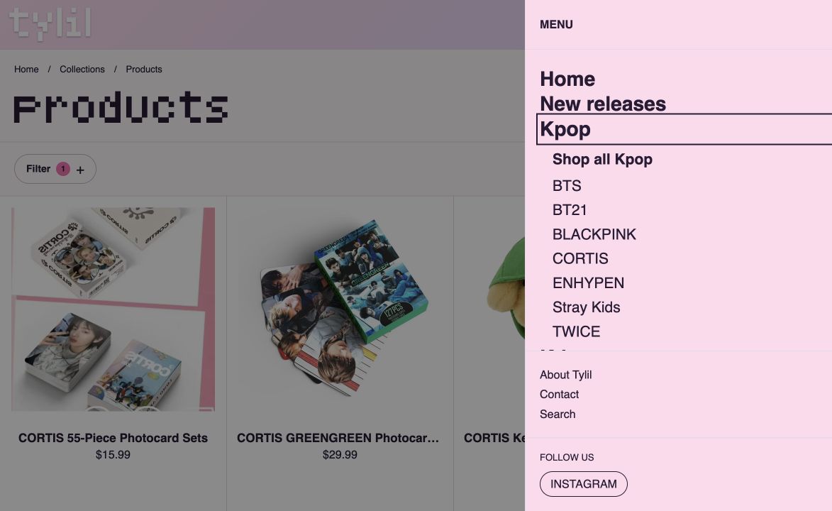
The two sidebars look similar, but I did not want to combine them. The main menu is for moving around the site. The filter is only for narrowing down the collection that is already open. Putting all of that into one drawer would make the menu ridiculously long.
What I Learned #
I spent a lot of time adjusting borders, spacing, colors, and shadows, but most of the annoying problems have actually come from the product data. A card can look great and still be useless if the product has the wrong tags, a massive title, or an image with a strange crop. The store has made me pay much more attention to how the products are organized behind the page.
I am still working on the site. The filter tags need more cleanup, and I want to keep improving how much information the cards show without making them crowded. The one-column mobile layout is easy to read, but it also makes a large collection feel much longer, so there is still a balance to figure out there.
Anyways, that is Tylil so far! I am still adding products and changing things whenever I notice something annoying. It is definitely not finished, but the card, sorting, and sidebar systems have made it much easier to keep the store organized as it gets bigger.